DAM
Comparing DAMs

Upgrading a software interface is a bit like improving a winding route into a town — you cut down a few trees, remove a few boulders and pave a more direct path. The upshot is that everyone’s journey is much easier and they’re happier as a result. Since we’re all about making people happy, that’s exactly what we’ve done with our upgraded user experience. First, we compiled insights on how our customers use Asset Bank, then we got to work creating an improved user experience based around people’s habits and preferences. We're proud to say that this upgrade has truly been shaped by our users.
Streamlined options have been introduced
The result? A smoother user journey via a more streamlined, intuitive layout that highlights popular actions. Thumbnails are larger, fewer clicks are needed to perform common tasks and overall, the layout is much cleaner.
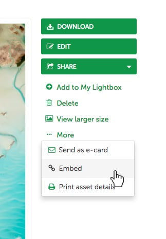
Buttons have been made larger and more intuitive
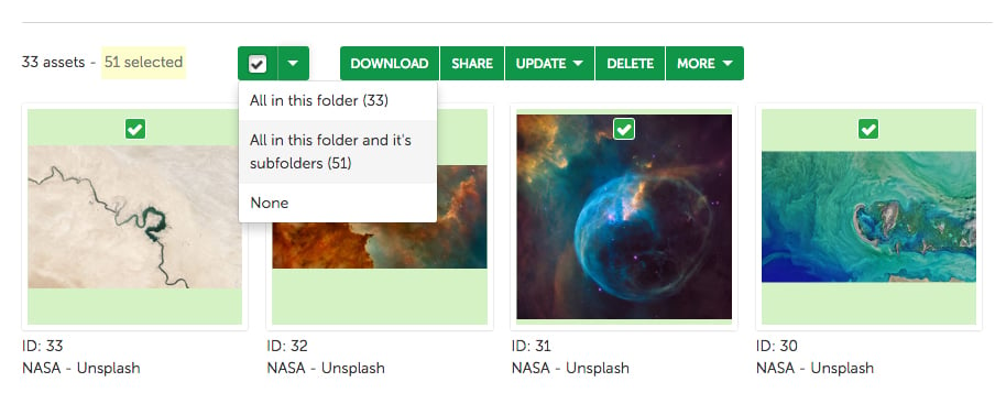
What’s more, the browse and search pages have been enhanced to give more space to the assets themselves. Improvements include more search results per page, shortcut links to the most popular sorting options, and greater consistency between browse and search, all enhancing the overall experience.
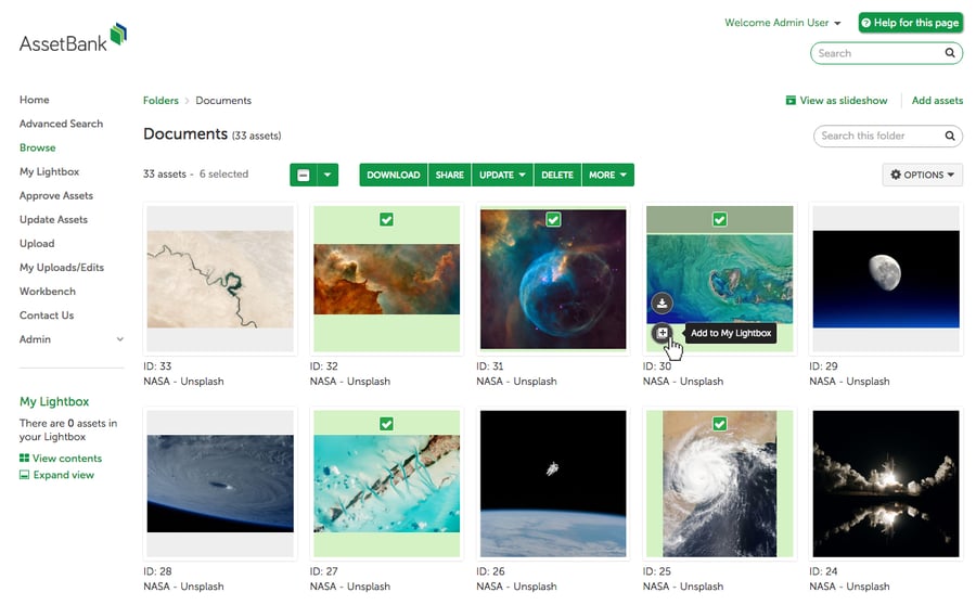
We've improved the browse and search pages
As well as our front-facing improvements we’ve also been busy making back-end changes by investing in the core of our asset storage model. Our goal? To stay at the forefront of the latest technologies, paving the way for future features that will benefit our customers. As you can probably tell, we’re pretty excited about our improved interface and hope you will be too. If you’d like an upgrade, get in touch for more information.
You'll also like: